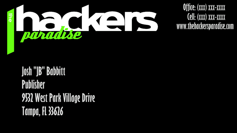
THP Business Card Contest

Just being devil's advocate here, so don't shoot me. With the more popular idea floating around, when you first look at it it looks like something a Green Bay Packer Backer would have in his wallet.

I personally think it looks muddled.
 
Just being devil's advocate here, so don't shoot me. With the more popular idea floating around, when you first look at it it looks like something a Green Bay Packer Backer would have in his wallet.

I personally think it looks muddled.

We want all opinions, but arent the packers colors white, green and yellow? If you check out the thread on our soon to be released magazine, you will see that it is the same colors as that.
 
They are. Minus any yellow on the card, I see green and white. When I look at it and the P seems to stand out in front of the H, making it look like Packers, instead of Hackers...but that's me. The more I look at it, the design is apparent, it just doesn't suit my eye. I seem to be in the minority though, so that's a good thing if you guys like it.
 
Good job razorback and Seth - I like those designs. When I get home from work, I'll have to post the design I emailed last night.
 
What ever design you end up with, might I suggest you try to include a picture of a "cute" puppy on the face, or back of the card. My wife gave me that idea for my cards. No one forgets a picture of puppy. Actually my cards have a picture of a puppy, and kitten napping together on them. Adding kitten was one of my grand daughters ideas. I get nice comments about my cards all the time.
For what it's worth..........

This is actually a pretty good idea. Business cards often get to looking all the same. This would do well to generate conversation and make your card stand out.
 
Heres a submission:

Font style, text, position of text, colours all can be change. More can be added and so on. I will alter it in any way you like. Only thing I am a little iffy about is the text placement on Joshs' email. I threw it somewhere so I could submit this, but it can be switched. I also added the reflection on the word "Paradise" but that can be removed as well. for more space. If you want I was also thinking of adding a little more pizzaz to the background to make it really stand out. I can add the adress in later because GG said she wanted the basics, Title, website, email, name, phone. which is what I added.

2uj5kip.jpg
 
Last edited:
If you like the black one, but want space for someone to write on it, make the back of the card plain white and there is then plenty of space for writing.
 
If you like the black one, but want space for someone to write on it, make the back of the card plain white and there is then plenty of space for writing.

+1. I do prefer business cards to be on white for readability, but the different colored ones stand out. Better would be the black banner across the top 1/3 to 2/5 and your information on white in the bottom 3/5 to 2/3. Maybe include the web address and maybe the email in the black part.

Black type on white looks better to me than white type on black. Plus if you use too fine (thin) type, the black will bleed over into the lettering on a matte stock, making the letters hard to read.
 
Here is the design I had emailed earlier. The saved image isn't the clearest. I prefer, simple, clean, crisp business cards, so that is what I tried to put together. I also added the feature of having the back of the cards be in multiple color options, utilizing the THP magazine colors, along with a corresponding logo. The colored backs provide a unique, differing feature, while allowing the white front available to write on for phone # changes, etc.
 
I have been in printing for a long time and seen a lot of bad designs. The biggest mistakes people make, in my opinion, are to clutter up the card with too much color or too large or intricate a logo or background design so you lose easy at a glance recognition of the important information, the name and address, email, etc. of the person identified on the card. Logos should not take up more than about a postage stamp size area on the card and the back should be kept clean with no printing. Printing the back of the card just makes it cost a lot more and no one looks at it anyway, unless they want to write on it and then whatever is there is obliterated. If you want a card that stands out then use a heavier paper, it is easy to find in a stack and feels richer when you hand it to someone without being terribly expensive.
 
Congratulations to SethO!!! His card design was chosen by the staff. Here is what the cards will look like:

Front:
705287564_8edsB-L.png


Back:
705287575_jSMx7-L.png
 
Congratulations Seth. I really like the card.
 
Looks like the photo of the driver was snapped at good ole' West Chase golf club. I could spot that driving range in a line-up of driving ranges anytime
 
Looks like the photo of the driver was snapped at good ole' West Chase golf club. I could spot that driving range in a line-up of driving ranges anytime

That is the one. A certain KiaMa special putter is in that photo too. As well as our new ICON THP Shoes
 
Well done Setho!
 
Thanks GG and JB. I am so happy! I had a lot of fun making this card. Thanks THP!
 
Congrats SethO!
 
Good job SethO!
 
Congrates SethO... Good job!
 
Back
Top