We've launched the new forums! Read more here
Navigation
Install the app
How to install the app on iOS
Follow along with the video below to see how to install our site as a web app on your home screen.

Note: This feature currently requires accessing the site using the built-in Safari browser.
More options
You are using an out of date browser. It may not display this or other websites correctly.
You should upgrade or use an alternative browser.
You should upgrade or use an alternative browser.
Logo Thoughts
You are using an out of date browser. It may not display this or other websites correctly.
You should upgrade or use an alternative browser.
You should upgrade or use an alternative browser.
- Status
- Not open for further replies.

_JL_
Let's Go Pens
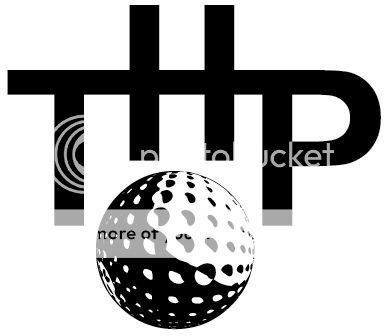
The only problem I see having just the box is that it reminds me of National Geographic.
Yep, I thought of both of those as well. And Nationwide insurance.I love the idea, but GG just said that it looked like H&R block and she may be right.


- Thread starter
- Admin
- #378
Makes me think of Taco Bell and thinking outside of the bun. "Thinking outside the box" is dated.
I agree yet it has continued to grow and help their business. I still like the idea and it does fit our model, just have to find a way to make it work. Still love the flower with the tee and ball too.
Spank818
Brian Gaysian
My artistic abilities are relegated to stick figures so I'll leave that to the experts but if you're looking for a catch phrase, how about:
THP, We live golf not just play it.
THP, We live golf not just play it.
_JL_
Let's Go Pens
Or just "Golf is Life."
- Thread starter
- Admin
- #381
I like both of the slogans.
Spank818
Brian Gaysian
THP, We live golf not just play it.
Or a spin on the original:
THP, don't just play golf, live it.
_JL_
Let's Go Pens
Much better.Or a spin on the original:
THP, don't just play golf, live it.
_JL_
Let's Go Pens
Maybe we should use the slogan as inspiration for a logo.
Something that encompasses all of life, like a globe or something.
Something that encompasses all of life, like a globe or something.
- Thread starter
- Admin
- #385
No globes for me. Far too overdone. Please remember that the Slogan works great for the website and even the magazine, but for the company as a whole, sometimes it is just an image.
One-T
Skimming since Nov 2009
- Joined
- Nov 12, 2009
- Messages
- 22,905
- Reaction score
- 230
- Location
- Franklin, North Carolina
- Handicap
- 12
- Thread starter
- Admin
- #387
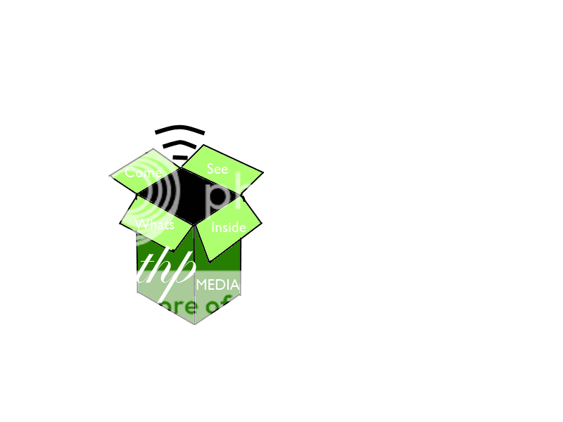
I like the look of the box, but the goal was thinking outside the box and I think that shows what is inside the box.
Hanks
On the Fringe
How about the THP logo breaking through a wall? The wall would symbolize a box or 'the norm'....THP breaking through, breaking new ground, freedom, etc?
- Thread starter
- Admin
- #389
Makes me think of Taco Bell and thinking outside of the bun. "Thinking outside the box" is dated.
How about the THP logo breaking through a wall? The wall would symbolize a box or 'the norm'....THP breaking through, breaking new ground, freedom, etc?
Intriguing!
- Thread starter
- Admin
- #390
Has this been done before?
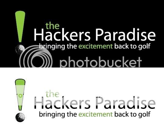
Just an exclamation point with the ball being a golf ball?
Just an exclamation point with the ball being a golf ball?
Hanks
On the Fringe
How about the THP logo breaking through a wall? The wall would symbolize a box or 'the norm'....THP breaking through, breaking new ground, freedom, etc?
Has this been done before?
Just an exclamation point with the ball being a golf ball?
The THP logo on a golf ball breaking through a wall or window?
_JL_
Let's Go Pens
Has this been done before?
Just an exclamation point with the ball being a golf ball?
Smallville
#ICanHitADraw
- Joined
- Oct 16, 2008
- Messages
- 98,737
- Reaction score
- 531
- Location
- Kansas City, Kansas
- Handicap
- In Flux
The only problem I see having just the box is that it reminds me of National Geographic.
That was what I thought of too!


- Admin
- #394
I like it! Not sure I like the shape of the exclamation point but I LOVE the idea and I actually really like the words you wrote to go with it. It's simple, but makes a bold statement. I really like it!
- Thread starter
- Admin
- #395
I am really digging the exclamation point. Still may want it white and green because it will be used in a lot of different areas though.
Dirt_Guy
I dig holes.
That is a pretty classy design. I know E entertainment uses the exclamation point, but as long as we don't have the boxy version it should be unique.
_JL_
Let's Go Pens
What would you change about the shape of the exclamation point, GG?
- Admin
- #398
What would you change about the shape of the exclamation point, GG?
I am honestly not sure I think maybe just a little fatter and JB was thinking maybe make the top green and keep the ball white. Because while the slogan is cool it won't always be there, sometimes it's just the logo so that's the part we need to perfect.
I completely forgot E! has the ! but hopefully it's not an issue since they are E! and not just the !...I am not sure.
_JL_
Let's Go Pens
- Admin
- #400
please don't kill me for asking for different variations but is it possible to remove the black outline and just have the green, I am just curious what the difference would look like. What are your thought son making the top part more square? I honestly don't know it is an honest question to you.
- Status
- Not open for further replies.