What do you think of crown graphics?

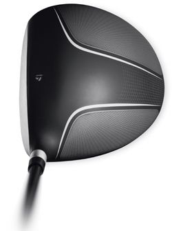
I remember when this first came out. I really liked the graphics. man, hard to believe that was all the way back in 07.

taylormade_burner_driver_crown.jpg


Another one I didn't care for is the Adams Speedline. I think the white crown made it worse than it really was.

2_Adams_Speedline_Super_S_driver_crown.jpg
 
It doesn't really bother me too much, I prefer black or charcoal but I'm willing to hit just about anything as long as keep hitting fairways and it doesn't set up closed.
 
Either a single alignment aid (I like the Callaway chevron myself) or one at the front and one at the aft of the crown (the original SLDR) work for me. Much more than that, I think, gets a bit distracting. I'm trying to pay attention to the ball, not the club.
 
Most of them don't bother me (i have an i25, so that goes without saying). But the nike one doesn't really seem to serve a purpose rather than to say "you're using a nike driver in case you forgot".
 
I'll pretty much play both. Graphics or aids on the crown really don't bother me.
 
Prefer nothing but a small, understated alignment aid on a solid color crown. But if I hit a metal club with crown graphics so much better than others, I would certainly adjust.
 
I don't mind crown graphics but have not found any that are appealing to me. If I did, it would not bother me
 
I prefer no Graphics but they never seem to effect ho well i hit the club
 
If everything is done in simplicity, I am ok with it. The i25 is a good example, the stripes didn't bother me at all, seeing the G30 the turbulators don't affect me. The Nike heads look fine to me too. I was not fan of any of the white driver heads from TM.
 
Makes no matter to me. I do like an alignment aid to help me at address though.
 
I prefer nothing on the crown. A logo for an alignment aid is fine but what was odd is I really like the look of the "Exotics" and swoosh on the Tee7 and Nike clubs but and the racing stripes are bad a$$.
 
I don't have a problem with graphics on the crown. I also don't have a problem with color. I think that some of the reds, blues, oranges, whites, lime greens, or silvers out on clubs now are drool worthy. I do think I like having an alignment aid and would want that.

My current driver is an RBZ. I like the color scheme it has. I'm pretty boring my life so... I don't mind having a bit of personality in my clubs and bag... driver especially I think is a nice to have.
 
I hate to say it, but I think I like them. Or at least the one's I've seen recently.

But I like the bold graphics as opposed to the thin, skinny little racing strips usually seen at the back of the club.
 
I want a solid, darker color, matte or gloss, with a simple alignment aid or nothing at all. I don't like it to be too busy.
 
Graphics don't bother me and in fact I kind of like seeing something different.
As far as an alignment aid goes, I don't need one. I don't believe it really helps me.
 
I have always liked what Titleist has for crown graphics. I think it just give you an aiming point.
 
Plain in either black or very dark grey is all I want.
 
For a crown graphic i prefer just a company logo or an alignment aid. Much more and it looks to busy for me. Example: I love my Cobra Bio Cells, but if the Bio Cell pattern went all the way to the front i highly doubt I would be able to game them as it would be way to busy for my eyes trying to line up.
 
Small graphics are fine, usually I like an alignment aid and that's it.
 
I hate them, I don't even like an alignment aid on the crown. If there has to be something, I prefer it to be away from the top line and closer to something like Nike does.
 
Some alignment aids are ok like the one on my Ping Anser, but any other graphics I can't do. I'll paint the head if I like a driver that has graphics on it.

2012-ping-anser-driver-6.jpg
 
I've always thought the i25 stripe was great looking. As long as it's not over done or too busy, I like a clean look.

8db2c133_ping_i25DRIVER1.jpeg
 
I tune all that out and focus only on the squared club face to the ball.
 
I'm not a huge fan of them. I gamed the R1 for a while, where as I got used to seeing them. I wasn't excited about them. I prefer a high gloss single color, but the Matte finish is not to bad either.
 
I am not a huge fan but some of the recent ones are ok. Like what was mentioned in the OP, I don't mind the i25 sort of alignment. Even the G30 isn't terrible,but the ones like the R1 and some simple alignment aids I can find distracting.
 
Back
Top