We've launched the new forums! Read more here
Navigation
Install the app
How to install the app on iOS
Follow along with the video below to see how to install our site as a web app on your home screen.

Note: This feature currently requires accessing the site using the built-in Safari browser.
More options
You are using an out of date browser. It may not display this or other websites correctly.
You should upgrade or use an alternative browser.
You should upgrade or use an alternative browser.
Logo Thoughts
You are using an out of date browser. It may not display this or other websites correctly.
You should upgrade or use an alternative browser.
You should upgrade or use an alternative browser.
- Status
- Not open for further replies.

bogeyme
The Golf GODS hate me
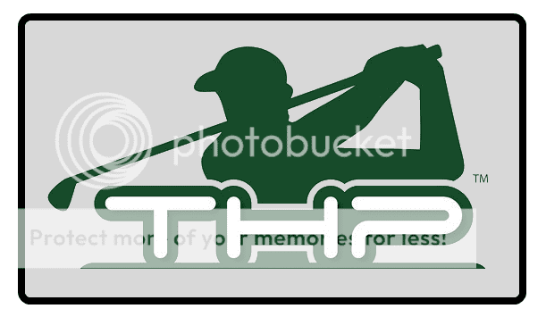
I like all the logos. The only problem with the one Setho came up with is I don't think it will transfer well to shirts, golf balls, towels very well outside of plain white. The shading is the problem. Also are we dropping the .com? Seeing just "The Hackers Pardise" makes me think of a sports bar or maybe a golf store, not a website or magazine.


- Thread starter
- Admin
- #53
I like all the logos. The only problem with the one Setho came up with is I don't think it will transfer well to shirts, golf balls, towels very well outside of plain white. The shading is the problem. Also are we dropping the .com? Seeing just "The Hackers Pardise" makes me think of a sports bar or maybe a golf store, not a website or magazine.
The .com is not listed on the logo by choice actually. Being that we are expanding past just a website right now onto a magazine, and things such as video and radio/podcast, we want it to be more about brand awareness and not a logo to a website.
I like all the logos. The only problem with the one Setho came up with is I don't think it will transfer well to shirts, golf balls, towels very well outside of plain white. The shading is the problem. Also are we dropping the .com? Seeing just "The Hackers Pardise" makes me think of a sports bar or maybe a golf store, not a website or magazine.
That is a good point. I just did those logo things for fun. To me, the one I made looks like the MLB logo a little.
_JL_
Let's Go Pens
Absolutely. I'll give it some thought and see what I come up with.Care to assist?
Absolutely. I'll give it some thought and see what I come up with.
I am excited to see what you come up with.
jefffann
Banned
- Joined
- Feb 10, 2009
- Messages
- 2,635
- Reaction score
- 27
- Handicap
- ∞
Don't know much about logos.But the THP should be a priority as there are really close ones without the the
http://www.hackersparadise.biz/
http://www.hackersparadise.com/
and also tshirts
http://www.zazzle.co.uk/hackers_paradise_dark_t_shirt-235767898819850388
http://www.hackersparadise.biz/
http://www.hackersparadise.com/
and also tshirts
http://www.zazzle.co.uk/hackers_paradise_dark_t_shirt-235767898819850388
JPsuff
Banned


-JP
- Thread starter
- Admin
- #59
Thanks for the effort. it needs to be a little more than that unfortunately. We love getting feedback from everybody, keep it coming.
One-T
Skimming since Nov 2009
- Joined
- Nov 12, 2009
- Messages
- 22,905
- Reaction score
- 230
- Location
- Franklin, North Carolina
- Handicap
- 12
I am not a computer garphics person at all, so the only advice I would give would be, whatever you do with the THP, I think should be the main focus. Like the belts, I liked that THP. For a while, I think the words "the hackers paradise" need to go with the THP logo. After it becomes a well know product(which it will) then do away with the words and keep the THP. So, I feel the most important part of this decision is the THP. Look at nike and puma for example. The swoosh and the puma were always with the name nike and puma, as they became so popular, they did away with the words nike and puma and just go with the logo now . I hope I made since, I am just thinking of the long term markting aspect.
. I hope I made since, I am just thinking of the long term markting aspect._JL_
Let's Go Pens
^ You're absolutely right, shanks. It is such an advantage to have a small, identifiable logo like that because you can do so much with it.
The problem in the golf world is, pretty much every company uses either: a silhouette of a swing, a golf ball on a tee, or a flagstick on a green or on some sort of landscape. I think we'd be well served to come up with something different than those.
My initial thought is working around the idea of the word "hacker." Personally, this makes me think of the moment the clubface hits the ball - The splash of grass, the crisp sound, and the pure feeling you get on that moment of impact. I would love to see a logo that conveys all of these things in one simple image, perhaps a small splash of grass blades. What do you think about that concept?
miller821
I AM the Big Kahuna!
The new logo is cool. But I do feel that it's missing something. What it's missing...I don't know.
I always tell my client's "Imagine this on what ever you are pitching" Does this convey everything that you want it to? Is it going to stick in the mind of potential customers?
Like I said.. I'll think about it today and maybe come up with something that will really scream!
I always tell my client's "Imagine this on what ever you are pitching" Does this convey everything that you want it to? Is it going to stick in the mind of potential customers?
Like I said.. I'll think about it today and maybe come up with something that will really scream!
One-T
Skimming since Nov 2009
- Joined
- Nov 12, 2009
- Messages
- 22,905
- Reaction score
- 230
- Location
- Franklin, North Carolina
- Handicap
- 12
I like the thought and I like that you have a feeling with the logo. From what I read, you are going to design something. I am not saying to put a flag, a ball, or anything with it. I am saying to focus on the look of THP and having that as your face for your company. But, I say if you have the tools to design then play with it. I would if I had the means.
SethO I like your idea of making it look like the MLB logo. I like all the logos that you and JB have put out for this, so I dont want you guys to get the wrong impression. I just think we need to brand THP in the mind
SethO I like your idea of making it look like the MLB logo. I like all the logos that you and JB have put out for this, so I dont want you guys to get the wrong impression. I just think we need to brand THP in the mind
SethO I like your idea of making it look like the MLB logo. I like all the logos that you and JB have put out for this, so I dont want you guys to get the wrong impression. I just think we need to brand THP in the mind
I agree. The way it currently is has something missing. A certian je ne sais quoi. THP is not trying to brand anything except for a good place to read/talk about golf. I don't think my logo works very well.
One-T
Skimming since Nov 2009
- Joined
- Nov 12, 2009
- Messages
- 22,905
- Reaction score
- 230
- Location
- Franklin, North Carolina
- Handicap
- 12
Well, they are not trying to brand anything, but as a company, you are always trying to brand yourself. EVERY company does.
_JL_
Let's Go Pens
And that is exactly why you still want something that stands out from the crowd.Well, they are not trying to brand anything, but as a company, you are always trying to brand yourself. EVERY company does.
Well, they are not trying to brand anything, but as a company, you are always trying to brand yourself. EVERY company does.
I completely agree with this. That is what I was intending with my post. You win with the words sir haha.
One-T
Skimming since Nov 2009
- Joined
- Nov 12, 2009
- Messages
- 22,905
- Reaction score
- 230
- Location
- Franklin, North Carolina
- Handicap
- 12
I completely agree with this. That is what I was intending with my post. You win with the words sir haha.
haha, YES!!!! jk, I wasnt trying too, I just took it the wrong way
couldbeu
THP or work? Hmmm...
- Joined
- Aug 18, 2009
- Messages
- 1,704
- Reaction score
- 1
- Location
- Binghamton, New York, United States
- Handicap
- 3.2
I really like the way the "THP" was done on the belt buckles. That was my personal favorite from all the other logo designs I have seen since I've been here. I think it's very cool, new age and it stands out to me. I like how all the letters work together, not blah at all. I agree that you may want to add something else to make it instantly recognized with golf, but I don't think you have to, most of the big companies don't. I would assume no matter what else THP decides to add to the logo they would still want the "THP" to be the overall focus.
_JL_
Let's Go Pens
I love the "THP" from the belt buckles, too. Would you consider just using that as the logo? We already know how well it works alone because of the web browser icon, which I think is very successful.
- Thread starter
- Admin
- #71
I like the idea of the buckle as a logo, but the problem is that for many, it does not have the general meaning that it has for us forum members. I like that font and styling, heck it made a great buckle, but I would like something to go along with it.
TC
Keg Thrower
so far i like what i've seen. i just might suggest a shape change for the logo. get rid of the squarish sytle and make it more oval shaped. You could even use the THP letters and make it in an oval shape, or you could use the THP that you have now, with the golfer guy but make it in an oval shape, or you could do an oval border with the THP letters inside with the words "The Hackers Paradise" wrapped inside the border line.
TwoSolitudes
Swingin' for the fences
- Joined
- Jan 15, 2010
- Messages
- 1,511
- Reaction score
- 11
SethO I like your idea of making it look like the MLB logo. I like all the logos that you and JB have put out for this, so I dont want you guys to get the wrong impression. I just think we need to brand THP in the mind
If the goal was NBA, MLB, PGA type of logo then it works. Just play with the colours a bit. But like others have said you have to think about what you want the logo to say. Who is your audience and what image do you want to portray. Are you the NBA or are you the Boston Celtics. If the former you want a serious logo that represents a non-controversial administrative body- if the latter you want to portray something else.
THP is about equipment- and regular golfers having fun with it (at least that is my impression). How about a golf bag full of clubs. You could design it so THP is written on the bag like a brand logo. Simple small and memorable and highlighting what THP is about.

Or how about a real hacker. This kind of idea

Or how about the moon shot? Like the MTV logo with an Astronaut putting. Or a golf ball breaking through glass (breaking through the crap of other 'review' sites)

The more I think of it the more I like the golf bag idea- you can do a lot with that.
Anyway just my 2 cents. Feel free to ignore me.
- Thread starter
- Admin
- #74
THP is about equipment- and regular golfers having fun with it (at least that is my impression). How about a golf bag full of clubs. You could design it so THP is written on the bag like a brand logo. Simple small and memorable and highlighting what THP is about.
I love the idea, but a lot of people have a different interpretation of what THP is. To me THP is a golf lifestyle place rather than just an equipment place. THat is what makes us different. Equipment, Style, Actually playing, travel, etc... are what makes this place different.
thedue
Another Day in Paradise
so far i like what i've seen. i just might suggest a shape change for the logo. get rid of the squarish sytle and make it more oval shaped. You could even use the THP letters and make it in an oval shape, or you could use the THP that you have now, with the golfer guy but make it in an oval shape, or you could do an oval border with the THP letters inside with the words "The Hackers Paradise" wrapped inside the border line.
That's actually kind of what I thought tc. If the THP and Hacker's Paradise were rounding up slightly, it would loose it's blocky appearance. Not to mention feel a lot better on a hat. Then a slight fade of light to dark from left to right across the logo.
- Status
- Not open for further replies.