

- Admin
- #1
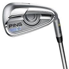
Rounding out the full line of G400 from PING are the new irons.

Follow along with the video below to see how to install our site as a web app on your home screen.

Note: This feature currently requires accessing the site using the built-in Safari browser.

It'd dampening. The number one complaint on the G irons with the eye cor tech was the face did get thinner to increase ball speeds, but it left a harsh feel/feedback. This is akin to the badging theyve used in the iSeries in the past to help dampen the vibrations and sound to provide a more all around pleasing sound/feel.I'm guessing there's a good reason for why the cavity looks the way it does.
This is a departure for a Ping design...I think I like it. Very techy.
Sent from my Nexus 6 using Tapatalk
Imo yes with the badging. Significantly for the G series.Is it though? Looks very similar to the previous iteration to me.
FWIW I believe it's actually more of a coppery color.Orange again? I thought they moved on from that.
Sent from my 6045O using Tapatalk
Imo yes with the badging. Significantly for the G series.
Interesting. They remind me nothing of the i20's. To me they look more like the i200's went off their diet and got badged up in black.Instantly reminds me of i20s
Sent from my iPhone using Tapatalk
Sure, iterative. I think the black moulding stands out to me.Imo yes with the badging. Significantly for the G series.
Interesting. They remind me nothing of the i20's. To me they look more like the i200's went off their diet and get badged up in black.
Absolutely agree. I've always leaned more to the i series than the G, and I think this will be consistent here as well.I want to see in-hand pics before I cast any judgement.
Sent from my iPhone using Tapatalk
Outside of the color black, I'm with you 100%.Interesting. They remind me nothing of the i20's. To me they look more like the i200's went off their diet and get badged up in black.
I always thought that switch to blue as "standard" was confusing to the average consumer. The lie angles never changed per color, just that Ping chose to sell blue as standard as they found it fit a larger percentage of golfers than black. Why not just change black to blue? They changed all of the colors a few years ago when they added a bunch (I went from orange, to purple to red over the years), so don't tell me it was for consistency.Also, are we back to black as a standard lie angle? All of the stock pictures from the last iteration were yellow.


