2014 Masters Scripting

It looks good, but man, Nike really got creative on the shirts :bulgy-eyes:.


Whoever put a pattern shirt with pattern pants needs to be fired.

It might be fashionably wrong, but I like it!
 
It might be fashionably wrong, but I like it!

I just can't haha nothing wrong with liking at though.

Sent from my Nexus 5 using Tapatalk
 
I like Rory's setup. I'd game it!


Sent from my iPad using Tapatalk
 
2014_Masters_Scripting_PR3_28424.jpg

2014_Masters_Scripting_PR4_28420.jpg

2014_Masters_Scripting_PR5_28422.jpg

2014_Masters_Scripting_PR6_28421.jpg

2014_Masters_Scripting_PR7_28419.jpg


Thorbjorn has to be my favorite.
 
Like...

- Molinari Saturday
- Olesen Thursday & Sunday
- Schwartzel Friday & Sunday
- McIlroy Friday & Sunday
- Spieth Friday & Saturday

Dislike...

- white pants. ALL the white pants.
 
Schwartzel looks pretty "blah" compared to othera. Then again, he's not a very flashy player.

Rap-a-tap Tappin' on my SG4
 
Nick Watney is the only one I like every single day of. I like Russell Henley's Thursday and Sunday looks a lot. For the other golfers there is usually at least 1 day that I would wear.

Looking forward to seeing what the Taylormade/Adidas players will be wearing this year.
 
Nike has got to be some of the most boring I've ever seen. Zero imagination on any of it.
 
Nike has got to be some of the most boring I've ever seen. Zero imagination on any of it.

I couldn't disagree more. I think Nike's scriptings are wonderful! They are outfits I could actually see myself wearing. If I was rich I would buy them all.
 
I couldn't disagree more. I think Nike's scriptings are wonderful! They are outfits I could actually see myself wearing. If I was rich I would buy them all.

Oh I'd buy some of it and wear it but overall I just don't see much in their designs. A lot of solid colors with nothing cool going in.

Just my opinon though. Puma has some good looking designs but some super ugly as well.
 
Oh I'd buy some of it and wear it but overall I just don't see much in their designs. A lot of solid colors with nothing cool going in.

Just my opinon though. Puma has some good looking designs but some super ugly as well.

I wouldn't say Nike's lineup is flashy at all, and you are right, not many designs/patterns, but honestly that's why I like them. I love their color combos. Maybe I'm boring!
 
I wouldn't say Nike's lineup is flashy at all, and you are right, not many designs/patterns, but honestly that's why I like them. I love their color combos. Maybe I'm boring!

Of course I type all this as I'm sitting in a solid red Nike shirt....ironic lol!

One of my favorite shirts is a Puma that is solid on the front but a cool design across the back on the shoulders. Not super flashy but not just a solid either.
 
sergio%252520dustin%252520jason_thumb%25255B1%25255D.jpg
 
Really liking Sergio's purple pants
 
DJ's Scripting looks so boring no color
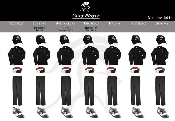
 
Nick Watney is the only one I like every single day of. I like Russell Henley's Thursday and Sunday looks a lot. For the other golfers there is usually at least 1 day that I would wear.

Looking forward to seeing what the Taylormade/Adidas players will be wearing this year.

I agree on Henley's TH and SU. Both look solid.

I'm getting more of an overall meh feeling on the scripting this year compared to last. Interested to see what else is out there.
 
Best scripting image EVER:

BkT1DKrCYAA7ZAm.jpg
 
Waiting on Horschel's....though I'm assuming for his first Masters he'll go more reserved like the British instead of bold like the US Open.
 
Jamie Donaldson, wearing J. Lindeberg:

JAMIE-SCRIPT.jpg
 
What are you talking about?!?! There's blue, black, white and at least two different greys. :alien:

I guess with Paulina on his arm he dose not need to draw any more attention she is much better than bright colors
 
Back
Top