
I know we have the google map of a bunch of THPers, but I was wondering if there was a chart that JB or smallville could post that showed a "heat map" of sorts that shows the density of THPers throughout the country.
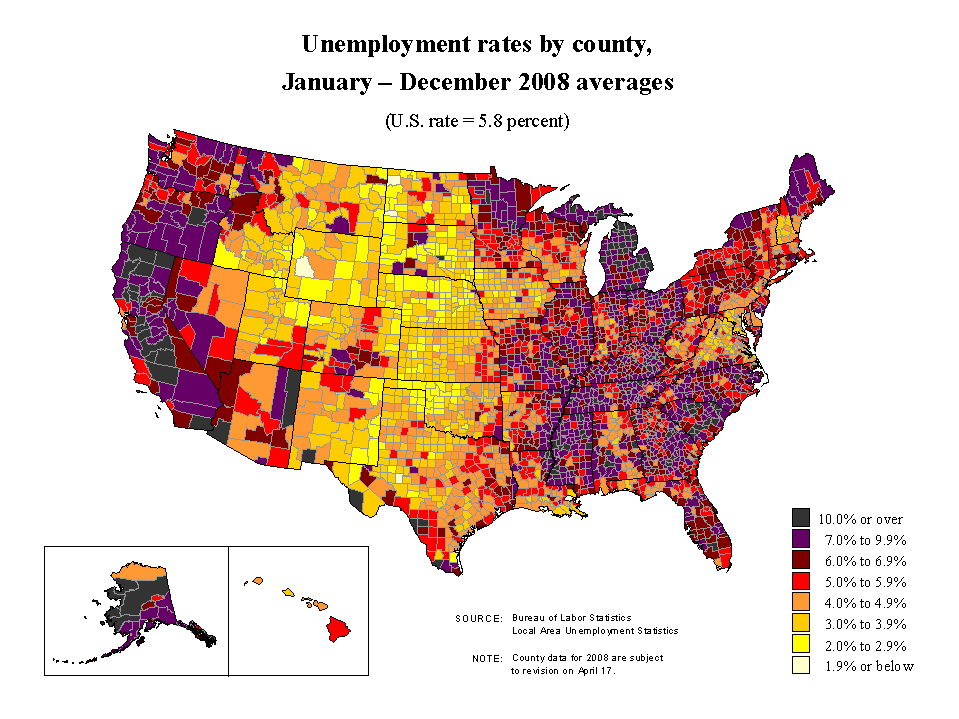
Something like this:
or this
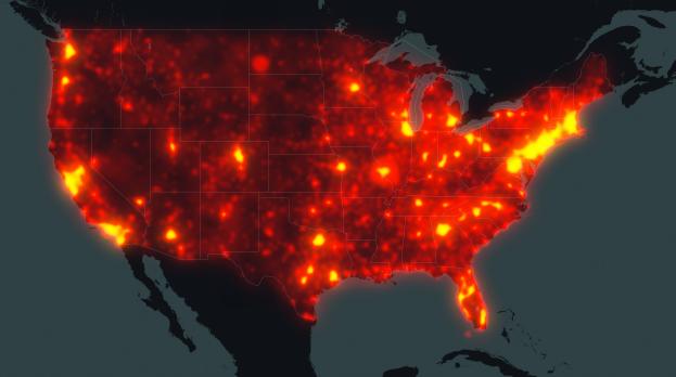
Something like this:
or this


