We've launched the new forums! Read more here
Navigation
Install the app
How to install the app on iOS
Follow along with the video below to see how to install our site as a web app on your home screen.

Note: This feature currently requires accessing the site using the built-in Safari browser.
More options
You are using an out of date browser. It may not display this or other websites correctly.
You should upgrade or use an alternative browser.
You should upgrade or use an alternative browser.
Favorite Logo In Golf
You are using an out of date browser. It may not display this or other websites correctly.
You should upgrade or use an alternative browser.
You should upgrade or use an alternative browser.


- Joined
- Sep 11, 2013
- Messages
- 74,824
- Reaction score
- 88,407
- Location
- Ponte Vedra, Florida
- Handicap
- 11.9
I would be lying if I didn't say the blocked "B" of Bridgestone. Prior to that I was a huge fan of "The Shark" logo.
CAA_Beat
Active member
That was a close second for me. I envy those of you who are sponsored by them this year.I would be lying if I didn't say the blocked "B" of Bridgestone. Prior to that I was a huge fan of "The Shark" logo.
amsmith61
Active member
I like the Titelist cursive, the Callaway Chevron, the SeeMore logo, the Adidas logo.. In short - I think I like them all.
Jeanthemachine
Earl of Limerick
- Joined
- Jun 6, 2010
- Messages
- 2,795
- Reaction score
- 3
- Location
- Englewood, Florida, United States
- Handicap
- GHIN 7.7
While it is not so popular anymore, I always liked the stylized, colorful Greg Norman "shark".
The Craig Stadler "walrus" was cool too.
The Craig Stadler "walrus" was cool too.
ryebread
New member
- Joined
- Apr 27, 2012
- Messages
- 2,556
- Reaction score
- 2
- Location
- Sasquatching for lost balls...
- Handicap
- Googolplex
To me, the best logos are ones that convey the name of the brand in a way that cannot be confused. There are two approaches -- spelling the name out and using a symbol.
On the "spell the name" type logo, I think Titelist is the best. It is simple, timeless and just screams the history of golf (and Titelist's linkage to that).
On the "picture" type logo, I don't think there's a better one than Cobra. You look at that, know it is a snake, know that snake is a Cobra.
This post screams for a poll.............
To me, the best logos are ones that convey the name of the brand in a way that cannot be confused. There are two approaches -- spelling the name out and using a symbol.
On the "spell the name" type logo, I think Titelist is the best. It is simple, timeless and just screams the history of golf (and Titelist's linkage to that).
On the "picture" type logo, I don't think there's a better one than Cobra. You look at that, know it is a snake, know that snake is a Cobra.
This post screams for a poll.............
I love how the cobra head covers look with the dangling club indicator. Just like a cobra flicking it's tongue and ready to strike!
iSukGolf
New member
Most days its this ...
Some people get it ... and like me, get a laugh out of it ...

Some people get it ... and like me, get a laugh out of it ...
I think right now it's the Bridgestone B Logo. Looks good on a hat (still need to get that camo one) and I think what really made me love it was how they almost ghost printed it on their clubs for the J40 line. Wedges are a great example. Understated but mean looking.


This one is pretty cool.

stevececil
Sweating it out in AZ!
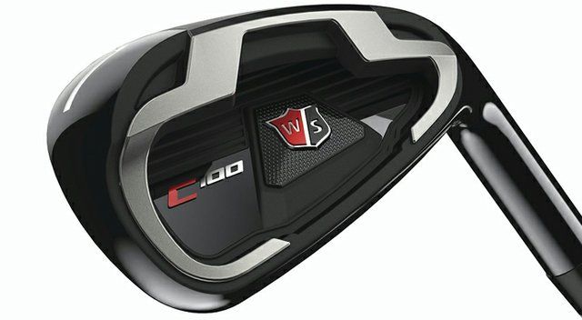
I have to go with Wilson love the updated look of the classic logo


The CG from Cleveland, Wilson Staff shield, and Cobra logos may be my favorite. There really is a ton of great ones.

I'm partial to the name plus its a cool understated logo on the back of a club.

And the old TP logo from TMAg. It reminds me of the Corvette emblem. I wish they would still use this on their irons.

And the old TP logo from TMAg. It reminds me of the Corvette emblem. I wish they would still use this on their irons.
CS
Major Hacker
I've always liked the puma monoline logo 

No clue if it's been said, but while I'm not crazy about the new Adams logo, I love just their "A" logo.

moosejaa
Mr. Inconsistent
No clue if it's been said, but while I'm not crazy about the new Adams logo, I love just their "A" logo.
I love this logo and can't wait til they offer up some hats with this on the crown to the general public.
davemate
New member
For me its the cobra logo and the titleist vokey wedges (so top gun)


oh and the amp cell logo is pretty good! see it


oh and the amp cell logo is pretty good! see it
Germerican
AngryYankee
Not sure why... I just like it (even if it looks like an ear).

Now I can't unsee it.
I am bias towards the Cobra logo. Snake is coiled up and ready to strike!
Castor Hades
New member
Huge fan of the Oakley "O"
Could be my favorite too.
P.J.
Active member
That just looks so cool to me...

golfsteve
New member
Not seen it mentioned but I really like the scratch logo, not just the logo but the understated look of their wedges in general
Sent from my iPhone using Tapatalk
Sent from my iPhone using Tapatalk

