We've launched the new forums! Read more here
Navigation
Install the app
How to install the app on iOS
Follow along with the video below to see how to install our site as a web app on your home screen.

Note: This feature currently requires accessing the site using the built-in Safari browser.
More options
You are using an out of date browser. It may not display this or other websites correctly.
You should upgrade or use an alternative browser.
You should upgrade or use an alternative browser.
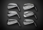
Mizuno Pro Irons: 221, 223, 225
You are using an out of date browser. It may not display this or other websites correctly.
You should upgrade or use an alternative browser.
You should upgrade or use an alternative browser.
- Joined
- Jul 2, 2018
- Messages
- 8,721
- Reaction score
- 10,456
- Location
- Sierra Foothills, CA
- Handicap
- --17--
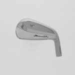
I'm okay with the script, just don't like how bold it looks with the dark fill. I think a more subtle look, like the running bird logo and the 22x model would make the script easier on the eye.
I don’t have any business hitting the pros with any regularity, the man do those look pretty
same here, but those are sweet looking!!!
- Moderator
- #29
I've clicked in here to look like five or six times wanting to feel something different but I just don't like the cursive script. But the irons look so good themselves!
223 looks and sounds interesting, and curious to see what the size of the 225 is. Going to be hard to get me into the 221 with everything else there is and will be, but 223's might be fun after what I thought was a fairly disappointing 921T and a smoking hot 921F. I don't mind the script.
- Staff
- #31
The idea of chromoly moving into a slightly smaller package is pretty exciting. The 223’s look like a lot of fun. So do the 225!
The 225 looks scary small. 
RatFink
Carnivore
These pictures are so hard to read without scale, but I'd hazard a guess that based on the distance between the hosel and the edge of the face texturing/painting, the 225 is longer in blade length than the 221s and 223s when you look at that one measure, though knowing Mizuno, these will probably blend quite favourably across the 3 models.The 225 looks scary small.
I could do without the script font as well.
Looks might be a half step back from the last line, but that's not a bad thing. Those last mizunos are as good as I have ever seen lookswise.
Looks might be a half step back from the last line, but that's not a bad thing. Those last mizunos are as good as I have ever seen lookswise.
View attachment 9016646
Fli-Hi looks really clean too. Looks like 3-5 so far on the USGA database. Really like the Mizuno Pro towards the hosel than the toe look.
Mercy me, look at that thing
I know the looks on them are spectacular. If they moved the script towards the heel on the rest they would hit it out of the park.Mercy me, look at that thing
- Joined
- Jul 10, 2015
- Messages
- 24,445
- Reaction score
- 13,062
- Location
- Southeast, South Dakota
- Handicap
- 7.6
For Mizzy.......less is always more. A small "M" badge......or a small "MP" badge is great. I dont hate it enough i wouldnt buy them.....lol. However i already own and am playing the current model. so maybe im a bit biased on the sleek no frills sexiness.
- Staff
- #47
I mean, it’s something they’ve been using through most of their history….THey look good. I think I see a Ping influence on one or two of those.
That cursive font is awful and needs to go. Surprised that got through Mizuno's usually tight filter.
THey look good. I think I see a Ping influence on one or two of those.
That cursive font is awful and needs to go. Surprised that got through Mizuno's usually tight filter.
The cursive is what they use in Japan. Doubt if it will make it to USA version.


